The Matching-Colour Trap: Why Contrast Can Help a Bouquet
Contrast in a bouquet can rescue a colour scheme that feels flat, using one deliberate shade to define its softer colours without overwhelming the flowers.
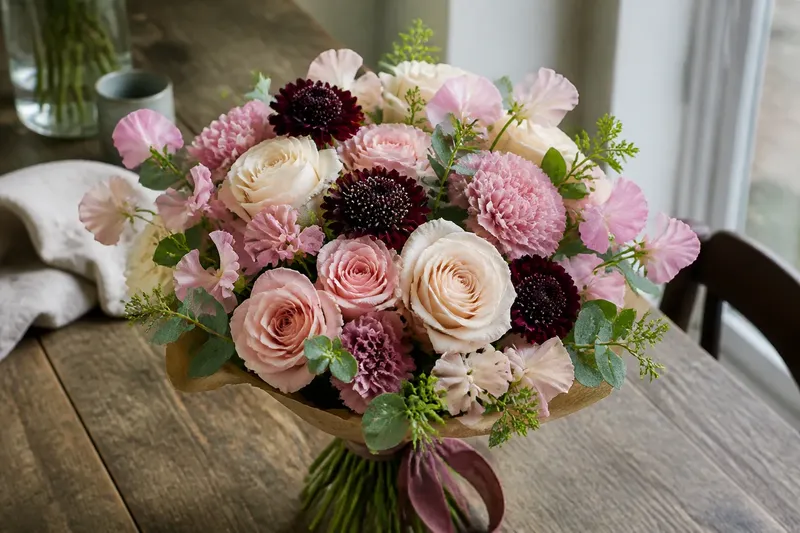
Why does a bouquet in lovely colours sometimes look oddly indistinct? Often, the trouble is that every flower has been asked to match. Contrast in a bouquet gives the eye a point of difference, making the quieter shades around it easier to read.
That does not mean adding the brightest flower on the shelf and hoping for the best. A useful contrast is deliberate and limited. It may come from a darker value, a warmer or cooler hue, or a small patch of colour that interrupts a run of similar tones. The aim is definition, not a colour argument.
When colours blur
The problem: Pale pink roses, blush carnations and cream lisianthus sit together, yet the arrangement looks washed out.
What causes it: The colours are close in both hue and lightness. Their boundaries disappear, especially when the blooms are viewed from across a room or against a pale wall. Adding another pale flower of a slightly different name may not change what the eye sees.
What to try: Introduce one deeper note, such as plum, burgundy or a clear raspberry shade. Keep the existing flowers; the contrast is there to clarify them, not replace them. A dark flower can provide that distinction with a small area of colour, while a stronger mid-tone may feel less formal.
Say you have a hand-tied bunch of cream roses and dusty pink sweet peas that seems to dissolve against a light tablecloth. Imagine adding a few deep wine-coloured scabiosa, while leaving the rest of the palette alone. The likely visible change is a clearer edge between the soft blooms and a more legible colour scheme, rather than a bouquet that has become mostly wine-coloured.
View the flowers from the distance at which they will usually be seen. A contrast that is subtle in your hand may be clear on a sideboard.
When the contrast shouts
The problem: A bouquet has plenty of definition, but one flower seems to dominate everything else.
What causes it: The contrasting shade may be unusually bright, unusually dark, or present in too many places. A single vivid orange bloom among soft lilac flowers can attract the eye; a scatter of orange blooms may turn the intended accent into a second, equally loud palette. Contrast is not automatically a small detail. Its strength depends on how different the colour is and how much of it appears.
What to try: First, decide whether the accent is too intense or simply too common. If it is intense, choose a muted neighbour in the same colour family: terracotta rather than sharp orange, for instance. If it is repeated too often, remove some stems rather than introducing another colour to mediate between them.
Compare the bouquet with its surroundings, too. A vivid accent may feel less abrupt against a patterned room or dark surface than it does against a plain white background. If the flowers need to work in several settings, keep the accent restrained enough to remain intentional in each.
Try reducing the accent before adding a new shade.
When the palette feels busy
The problem: The arrangement contains several attractive colours, but none seems to belong with the others.
What causes it: Each new flower has been selected to match a separate petal, leaf or ribbon. The palette then accumulates small decisions without a shared direction. Colour names are not especially helpful here: two flowers described as pink can differ sharply in warmth, depth and saturation.
What to try: Look for a relationship among the colours already present. A warm grouping might include coral, apricot and soft yellow; a cooler one might pair lilac, blue-violet and pale green. These are not rules about which flowers may share a vase. They are ways to notice whether the colours lean towards one another or pull in separate directions.
Then choose one contrast that supports the group. A cool blue-violet can sharpen warm peach without requiring every flower to match peach exactly. Alternatively, a warm rust note can give a cool lilac palette a clear counterpoint. Keep the contrast related through depth or softness, rather than asking a very pale, muted scheme to absorb a single highly saturated colour without warning.
When choosing stems in person, place them side by side in natural light if possible. Shop lighting can make a colour look warmer or cooler than it does at home. The petals themselves are the more useful reference than the printed label.
When the accent looks accidental
The problem: One contrasting flower reads as a stray rather than a considered choice.
What causes it: The accent may have no visual connection to the rest of the bouquet. A lone bright yellow bloom among restrained mauve and ivory can look as if it arrived from another bunch, particularly if its shade is absent elsewhere.
What to try: Give the accent a quiet echo. This need not be another flower of the same colour. A yellow-green stem, a soft golden centre or a small detail in the surrounding palette may make the accent feel connected. Another option is to choose a less vivid version of the contrasting shade, so the colour still differs but does not announce itself quite so loudly.
Think of an accent as a conversation between colours, not a badge pinned to one bloom. The connection can be subtle; repeating the exact shade in several places is not compulsory.
When colour changes by room
The problem: A colour combination looks balanced on a worktop but awkward once placed where the bouquet will stay.
What causes it: The background and light affect how flowers appear. A cool grey wall can make a warm peach shade seem more vivid. A wooden table may draw out warmer tones, while a bright window can make pale petals seem almost white. The bouquet has not changed, but the setting has become part of what the eye reads.
What to try: Hold a few stems against the intended background, or set the finished bouquet nearby and look at it from the room entrance. If the contrast now dominates, reduce its presence or select a softer version. If the arrangement still blends into the setting, a deeper or cooler accent may give it definition.
Do not make every colour imitate the room. A bouquet can sit comfortably in a space without disappearing into its curtains.
How should contrast work?
Does every bouquet need a contrasting colour?
No. A quiet arrangement can rely on shifts in flower shape, texture and subtle colour difference. Contrast is useful when the palette feels indistinct, not an obligation to add a dramatic stem.
Can green count as the contrast?
Yes, particularly when foliage is noticeably darker, cooler or more yellow than the flowers. Green often supplies a natural pause between petal colours, though a pale, sparse foliage choice may not provide much definition.
Should the contrasting shade appear more than once?
It can, but it does not have to. A single accent may look deliberate if its hue suits the palette and its presence is proportionate; repeating it in several stems can help when one isolated bloom feels disconnected.
What if the flowers cannot be rearranged?
Work with what is already there: change the background, use foliage to soften a sharp boundary, or remove a stem that overwhelms the palette. A vase cannot correct every colour decision, but its placement can alter what the eye notices first.
A restrained final check
Before adding a contrasting shade, name the problem plainly: blurred colours, an overbearing accent, a busy palette or a flower that looks misplaced. Each calls for a different adjustment. Choosing a second accent to solve all four is a reliable way to create a fifth problem.
For contrast in a bouquet, start with one clear difference and assess the arrangement from its intended viewing distance. If the softer flowers become easier to distinguish and the accent still feels connected, the colour scheme has gained definition. If the accent is all you can see, scale it back; the flowers have made their point.